Final: Self Portrait

Artist Statement:

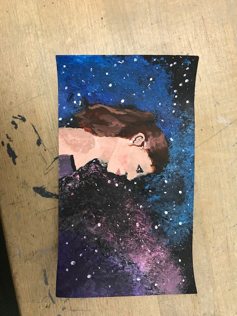
My final for my art class was a self portrait. I decided to do mine on a postcard size piece of paper and used acrylic paints as my medium. The subject in the painting is a side profile of myself, while the background is a simple galaxy including hues of blue, purple and pink, with stars speckled throughout. The title of this piece is “Infinite Thoughts.” I named it this because at times, I feel like my mind is always racing and goes on forever, just like the universe. A unique technique that I used was putting a bit of paint on the end of a crumpled paper towel, and stamping it onto the background to give a good galaxy effect. I also used a flat brush and flicked it while it had white paint on the end to create small stars spattered throughout the background. My inspiration for this artwork was my brother. He is a photographer and I love the pictures of the sky and stars he has done. They are some of my favorites. I also feel that I can relate to his artwork. I tried to express a sense of curiousity in my artwork, and hopefully I achieved that. My goals as an artist is to just create more. I really enjoyed this class and getting to be creative everyday, and I need to push myself to do it more often. I also want to do more of what I wanted when creating, and I feel like I did. I don’t prefer to do still lifes and really realistic things, nothing personal I just don’t enjoy them. And with this assignment I was able to add my own ‘flair’ to my piece. While creating this piece, I learned that I am really judgemental of myself. Especially my abilities. I don’t exactly like how it turned out, and wish that I was better, but that takes time, and I need to accept that.

Still Life

My practice sketch in my sketchbook
A colored-in version of my practice in my sketchbook
I started painting but didn’t color match well enough, and also forgot to start with painting the background.
I still don’t think my painting looks the most realistic, but I am proud that I was able to find 10 colors in the background.
The color matching I used for my painting
The final product

For my T.A.G critique, I asked my table partner Gabbi Fenton to help me out. For the compliment, she said, “I like the compostition and colors” which made me feel proud because I spent a long time trying to color match the background in my originial still life photo. Her question was, “Why did you take such little time on it?” She thinks that I didn’t spend a ton of time on it but I came in during my off period and lunch to work on it more to make sure I had time for my self portrait. Her suggestion was, “Shade your leaves more” I did go back and do this because they did look very two dimensional.

My art in my opinion looks a little bit like a cartoony version of the original. I find trying to create practically an exact replica of a picture is challenging and definetly not what I prefer when painting or drawing. The subject matter was things I use in my everday life, as well as some flowers I thought were pretty. My cup is used to drink tea every morning in an attempt to give me a boost of energy, the earbuds to listen to some music, and the book because I try to read a little bit everyday. I guess the title of my work would be, “Everyday Necessities” because I need to use these things everyday to feel like myself. The red and green of the flowers stands out the most since the majority of the painting seems to be black and white, creating a nice contrast. The medium I chose to use was acrylic paint. I had never used it before and it seemed interesting. I quite enjoyed using it. My inspiration for my artwork was freely painting, and just enjoying myself throughout the process. I tried to show a bit of peace or serenity, showing how the simple things in life can bring joy to someone. My goal as an artist is to develope my style of art. I prefer drawing cartoon type things, not realistic things. So this assignment definetely push me out of my comfort zone but it is not what I prefer to create. While creating this piece, I learned that when you look closely, certain objects have more depth and colors than at a glance.

Showcase Critique

For the level 1 drawing, I walked down the 2nd grade hall. I found one by a girl named “Alice.” She had to draw what she thought was “The Night At The Puget Sound.” Her medium was watercolor.

  1. Describe: The artist used vibrant watercolors to create a wonderland of colorful fish. One fish in particular at the bottom has sinister looking teeth yet at the same time a very colorful and happy aura.
  2. Analyze: The artist was able to create a gradient using watercolors which is impressive for a 2nd grader. She also used crayons for some of the fish to create a crayon resist which added a nice secondary medium to the mainly watercolor piece.
  3. Interpret: I think that this artist was excited to be able to use many different colors at once, and it creates a very exuberent and exciting piece. The many different types of fish show not only the diversity in the Puget Sound, but the Mercer Island School District as well.
  4. Judge: I personally would not hang this up in my room. However, I think that this artist has a bright future with her creativity.
The Night At The Puget Sound, a “Developing” level

For this level 2 drawing, I was drawn to this piece especially. The artist, Joyce L., goes to Islander Middle School and is in Art II. The artist had to draw a superhero in her eyes. The medium used was colored pencils.

  1. Describe: The artist drew a superhero named “Phoenix Woman.” Along with the drawing she had to give a description of what this superhero would be like. One quote from it being, “this is Phoenix Woman. She is the king of the birds.” The hero is wearing an intricate kimono, and has a sword in a sheath. The majority of colors in this piece are pastels giving the character a light and airy side, along with the wings.
  2. Analyze: This superhero seems to be from Asia and has a very powerful aura. The intricate details on her show the attention to detail from the artist. There are many clothing details that are historic in Asian countries showing that the artist did their research before drawing this piece. The lines in this piece are quite neat and uniform throughout the whole drawing. There is also a sense that you can see the movement of the superhero as she walks towards you.
  3. Interpret: I think that this artist was trying to bring Asian representation to the superhero community, and I believe that it is a great idea. The artist seemed to give this superhero an elegant yet lethal look which draws me into the piece even more. If this superhero was real, I would feel safe and protected.
  4. Evaluate: I would not personally keep this art piece, however I am very drawn to it. This drawing is well done in my opinion because of the attention to detail. I have seen many drawings similar to this, however the artist gave their own personal twist to it by making sure every detail was accounted for. I do wish however that the artist was able to show more skills and techniques with colored pencils, as well as spending more time on the wings in the backround.
Phoenix Woman, a “Proficient” level

This artist, Sarah Salisbury, created a unique and enchanting painting. The senior in highschool painted a complex, yet still somehow simple, piece that drew in many viewers:

  1. Describe: The drawing is still and shows flower using a glass Coca Cola bottle as a knocked over vase. The vase and flowers are laying on a liscence plate from Claifornia while the backround has a navy blue object that seems to resemble a blanket. This piece seems to be modern and contemperary.
  2. Analyze: The shapes of the main objects in this piece are very similar to their real life conterparts. The texture seems to be soft even though the majority of these objects are hard in real life. The colors throughout the whole piece are on the color side, however the pop of warmer color for the label on the Coca Cola bottle and California on the license plate are refreshing. The artist was succesful in making this painting seem to be 3d. The artist shows many different techniques and is able to tie them all together to create a coherent and beautiful piece.
  3. Interpret: I am not quite sure what this artwork is truly about. If I could ask the artist a question, I would ask, what inspired you to create this piece? The piece is very unique and has many different key ideas, that being the license plate, Coke bottle, flowers, and a white origami crane. The mood that this piece is able to convey however is that of peace and harmony with objects that may not be associated with eachother typically.
  4. Evaluate: I would love to have this art piece hanging in my room. The piece is unique and radiates a calm energy to all of its onlookers. The strengths of this work are making different objects be coherent in a singular piece. I personally like this piece because I find that whenever I look at it, I discover something new. Whether that be a slight detail within the label of the Coca Cola bottle, or a petal of a flower that might be slightly askew.
A “Mastery” level

For the masterpiece version, I found a lot of high level pieces but none of them really spoke to me. I found one though by an artist named Jada Merritt. The piece was simple, just black and white. But the detail within the foreground and backround was really unique in my opinion.

  1. Description: The piece did not have a title, however I felt it did not need one. There seem to not be many smooth edges creating a sense of chaos throughout the whole drawing. The cabin in the foreground and the mountains within the backround create a nice depth. Throughout the drawing there is no symmetry or true uniformness, which adds to the idea of a type of chaos in this drawing.
  2. Analysis: The work was drawn. Throughout the whole piece there seems to be crosshatching in many places. A pattern that also appears in the work is contrasting between light and dark. That is apparent with the mountains specifically. The main point of emphasis in this drawing seems to be the cabin. Simple and dark, yet at the same time complex and in a way repelling.
  3. Interpret: The way that I interpret this piece is the chaos in the world. The nature contrasted with darkness shows how even the most beautiful things in life can still have dark sides. This piece makes me think about how much I love nature, yet at the same time I am scared of it. If I could ask Jada a question, I would ask if she was considering any metaphors or analogies while creating this piece.
  4. Evaluate: In my opinion, the best past of this work is how Jada was able to create a sense of movement in the tall grass of the foreground. Throughout the whole drawing there seems to be a bit of movement, nothing in the drawing is stagnant. I like this drawing because of its simplistic style, I would definetly like to have it hanging in my room. The drawing both piques my curiosity and calms me in a way.
A “Mastery” level
My attempt at the drawing above

Black & White Gridded Drawing

For this assignment in my art class, I struggled to find a picture I wanted to draw. But while looking through an old magazine I found an advertisment for Cambell’s Soup and thought, “why not?”

The Cambell’s Soup advertisement after I gridded it

I did not know where to start so I just started with the bowl, it seemed like the easiest portion of the drawing.

I do not know exactly why I chose this picture, it seemed to have many different styles of drawing and seemed to be a challenge while at the same time not having too many details. This picture proved to be harder than I thought it would because I find it challenging to find the right shade.

Before I added the final touches to my art

One of the most challenging parts of this drawing for me was drawing the steam coming off the bowl of soup. It was challenging because the steam did not seem to have a specific shape and almost flowed like water.

The finished product for my drawing along with a TAG critique

For the tag critique I talked to one of my table partners. For the compliment, he said that he liked the details within the backround of my drawing. For the question, he asked why I chose this drawing. And for the suggestion, he said I should add more detail to the soup.

Split Portrait Drawing with Charcoal Shading

For my Painting and Drawing class, we had our first assignment, to do a charcoal drawing. For the most part, I have just done sketches, I never had done much shading because I was scared in a way of ruining my drawing.

A sketch of the “big ideas” of the original picture that I chose of John Lennon

One thing that we did in class is a “TAG” which basically is a reaction from someone else. I had Gabbi Fenton do a TAG for me after my original sketch of John Lennon. Her first part (a compliment) read, “I like the texture of the hair. The second part (a question) read, “Did you enjoy drawing the picture?” I did, the majority of the time when I draw it is quick sketches during classes, I feel that I did not devote enough of my time to draw. The third and final part of the TAG (a suggestion) read, “shade the mouth more.” I definetly agreed with that, but I had to overcome my fear of shading my drawings and just dive in head first.

My finished version of my drawing of John Lennon

My Artist’s Statement:

My life has always had music in it, from a young age my parents would constantly be playing classic rock especially. Kings Of Leon, Death Cab for Cutie, and even the Beatles were some of my favorites from a very young age. I had always been drawn to the unique look and personas of the Beatles, especially John Lennon’s signature glasses, drawing him seemed like an homage to him for filling up my life with music and joy from a very young age.

A Reflection:

I feel that this drawing was a step forward in my artistic abilities after remaining stagnant for many years. I never seemed to expand on my art, just doing the same sketches over and over again. But pushing myself into doing something new seemed to expand my abilities, I am now more open to drawing new things, and drawing more details as well. I feel that what I struggled with most with this drawing was the hair. I found it challenging to add texture and movement to the hair and I still think it is a skill I can work on in the future.

All About Me

“”You miss 100% of the shots you don’t take” -Wayne Gretzky” -Michael Scott

My friends from Puerto Rico, Alejandro and Aidalis, after Bandfest in Pasadena

My name is Addison Arvish, but I go by Addi. I don’t know how I got that nickname, it kind of just happened when I was little and it just stuck with me all of these years.

I am 16 years old, terrified to grow up, but still craving freedom. I don’t really know what I want to do with my life but I have an idea. Since I have always enjoyed taking care of people, being a nurse that works in a NICU just seems to draw me in.

Playing at Band Camp the summer before my Sophomore year

The majority of my life is devoted to music, most of my time is spent in the band hall at Mercer Island High School. Music has always been a huge part of my life, and my taste is constantly changing. My two current favorites are Billie Eilish and Odesza. My most proud moment was even in band when I became a section leader as a Junior, a spot that is typically held by Seniors.

My dog, Bogey, and I while on a hike near Snoqualmie

At home, I live with my mom and my dad, while my brother goes to Western Washington University. My mom is probably one of the people I most look up to in my life, she has always tried to encourage me to do my best in life and has shown me how to be resilient. My family also has a ten-year-old dog, Bogey, who is one of my best friends. I also have two beta fish, Don Swanson (named after Ron Swanson from the TV show Parks & Rec) and Digt (a nickname for the character Dwight in the TV show The Office).

One of my favorite moments from my childhood was with my dad. It was my 6th birthday, and I had been begging my parents for a Barbie Dream House. On the day of my birthday, my parents told me there was a present waiting in the living room. I ran downstairs and found a homemade “Barbie Dreamhouse.” My dad had spent weeks making me my own personal dollhouse, it was painted with my favorite colors, pink, purple, and yellow. And it was mine.

Libby Egan and I running during a Cross Country Meet

I have never been the most athletic, but I still found joy in running and the outdoors. Some of my favorite hobbies include running cross country and skiing. If I am not trying to get outside though I find plenty of comfort in reading my favorite book series ‘A Game Of Ice And Fire’ by George R.R. Martin. I also enjoy creative writing. My favorite thing to snack on while reading or writing is some Chips & my mom’s homemade guacamole. Another one of my favorite things to do, and possibly a talent, is being able to sleep for 20 hours straight.

I also greatly enjoy math, something people typically raise their eyebrows at. For me, math is black and white. It is numbers and equations, and in a way math is beautiful.

The MIHS Girls Cross Country team (I am far right)

There are many things I do not like though, like small spaces which are the absolute worst. As well as being home alone and hearing a strange noise. Watching my fair share of crime documentaries has definitely not helped with that last fear.


My drawing of John Lennon

I have always enjoyed drawing and sketching but I never thought I was very good at it. I have always wanted to practice more and get better.

My three panel drawing of Patrick Star